good Q Frozen Yogurt & Coffee Bar
Commissioned by: good Q Café, Berlin
Corporate design (logo design, print stuff, packaging, wallpaper design for interior)
Print & technical production
Commissioned by: good Q Café, Berlin
Corporate design (logo design, print stuff, packaging, wallpaper design for interior)
Print & technical production
©jessicakleffner2024
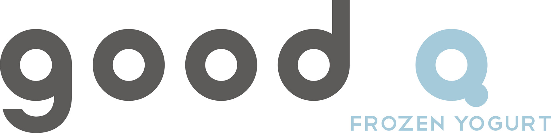

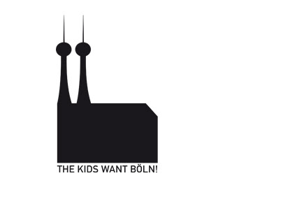
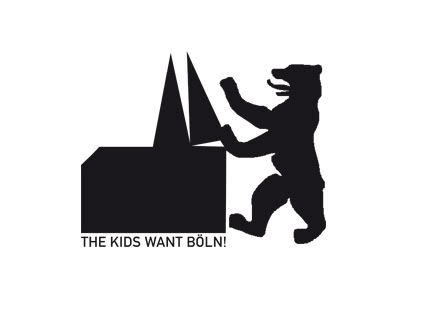
Logo & Color Options
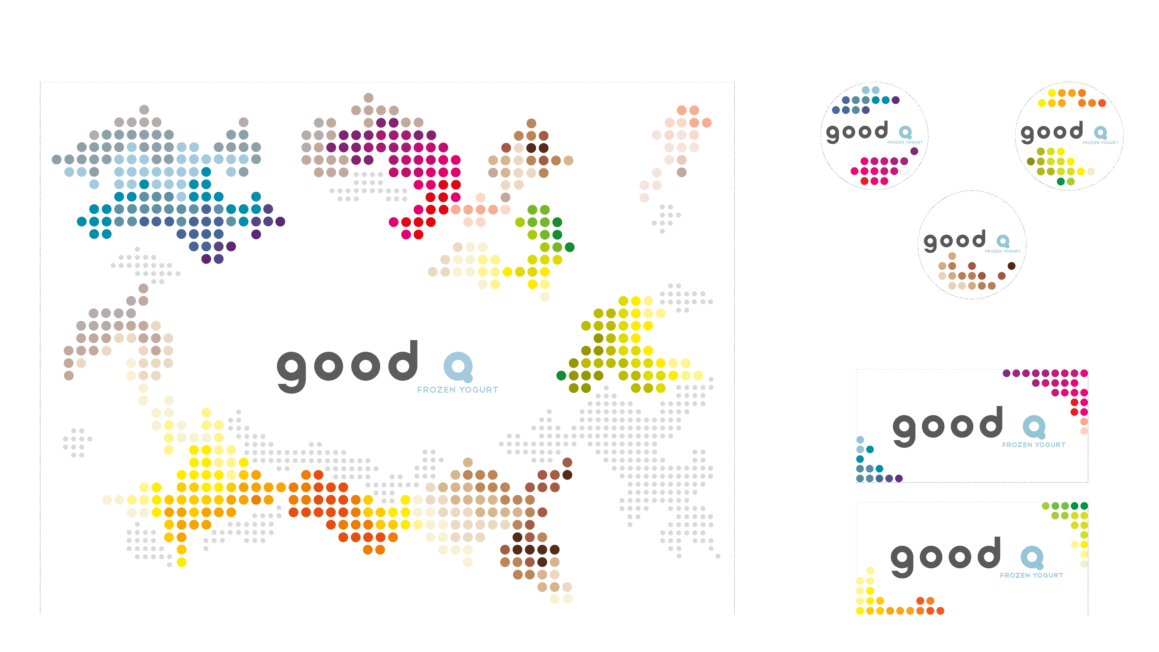
Illustration for Wallpaper & Stickers
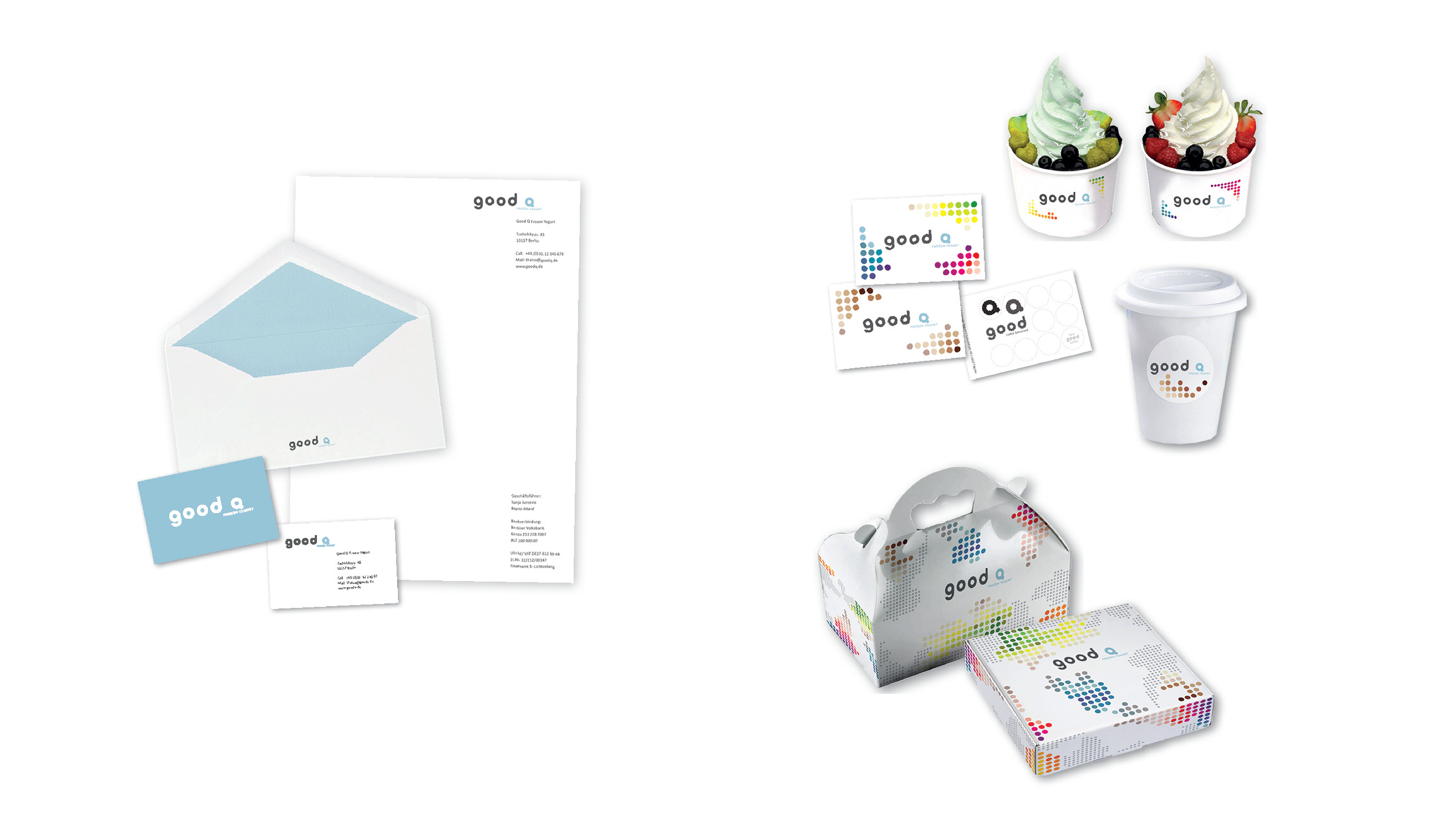
Business Papers & Packaging